MadCat Brewery brand building
About the project
Brand building for a Czech brewery surely poses a challenge. Almost everybody here is a natural-born a beer drinker, and microbreweries have been experiencing a huge boom recently. Add the fascination by craft breweries and you’re up for a couple of sleepless nights 🙂 We have known the guys from Kamenice for several years and we got convinced that they really DO understand beer. When they asked us to create a brand for their new microbrewery, which will break down all stereotypes related to Czech beer brewing, we decided to go for it!
Name
When creating the name, we took two assumptions into account: we wanted to reflect their business style, namely their innovation and progression, and their “not giving a shit” approach to brewing beer. Simply, uncompromising quality, even though it may often be shocking. That’s why “Mad”. The idea for the other part of the name came directly from the client. The new brewery was set in a beautiful old distillery. Since the very beginning of the reconstruction, there was a kitten, “Cat”, hanging around. In the end, it stayed there till now and became a brewery mascot. A personal relationship towards the new name is guaranteed. “MadCat” was born.
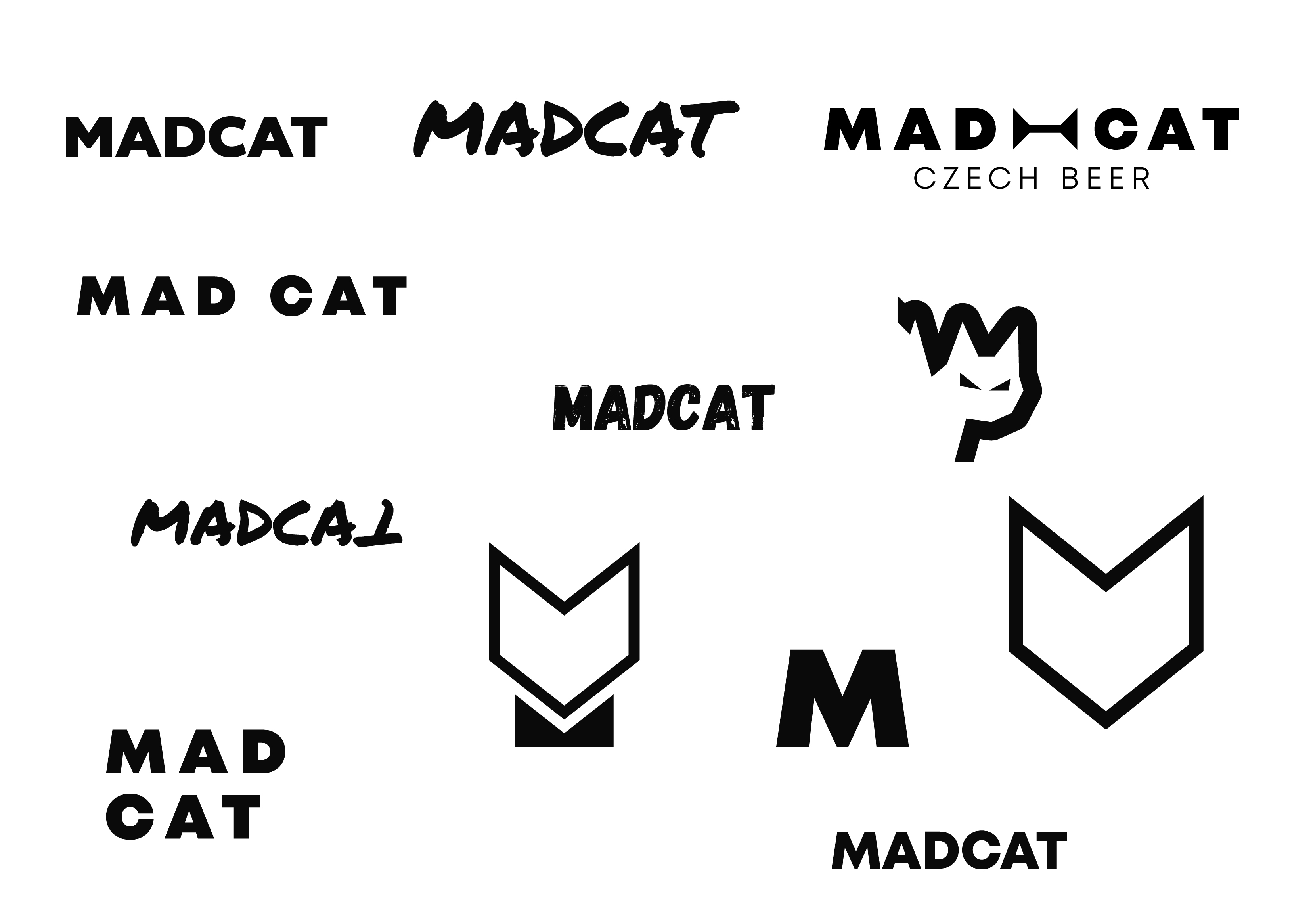
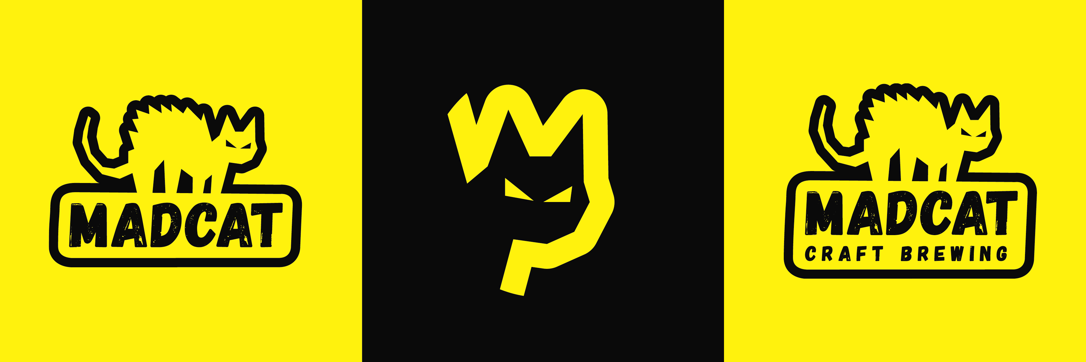
Logo
When creating the logo, we considered both the name and the analysis of the client’s segment. The logotype of a bristled mad cat is perfectly corresponding with the brewery name. It’s complemented by “MadCat” name in Gagalin Regular font whose “shabby” look indicates a craft brewery where no one gets scared to roll up their sleeves and get down to work. The beer brewed there is surely no mass affair. The logo can be complemented by “CRAFT BREWING” in Mont Heavy font to make clear what sort of business it is. To accompany the logo and for specific use on labels, we created a separate visual of a cat’s head with no text in it. The logo is super simple which makes it really variable and stands in contrast to other microbreweries that have recently focused on cartoon motifs and complex graphics.
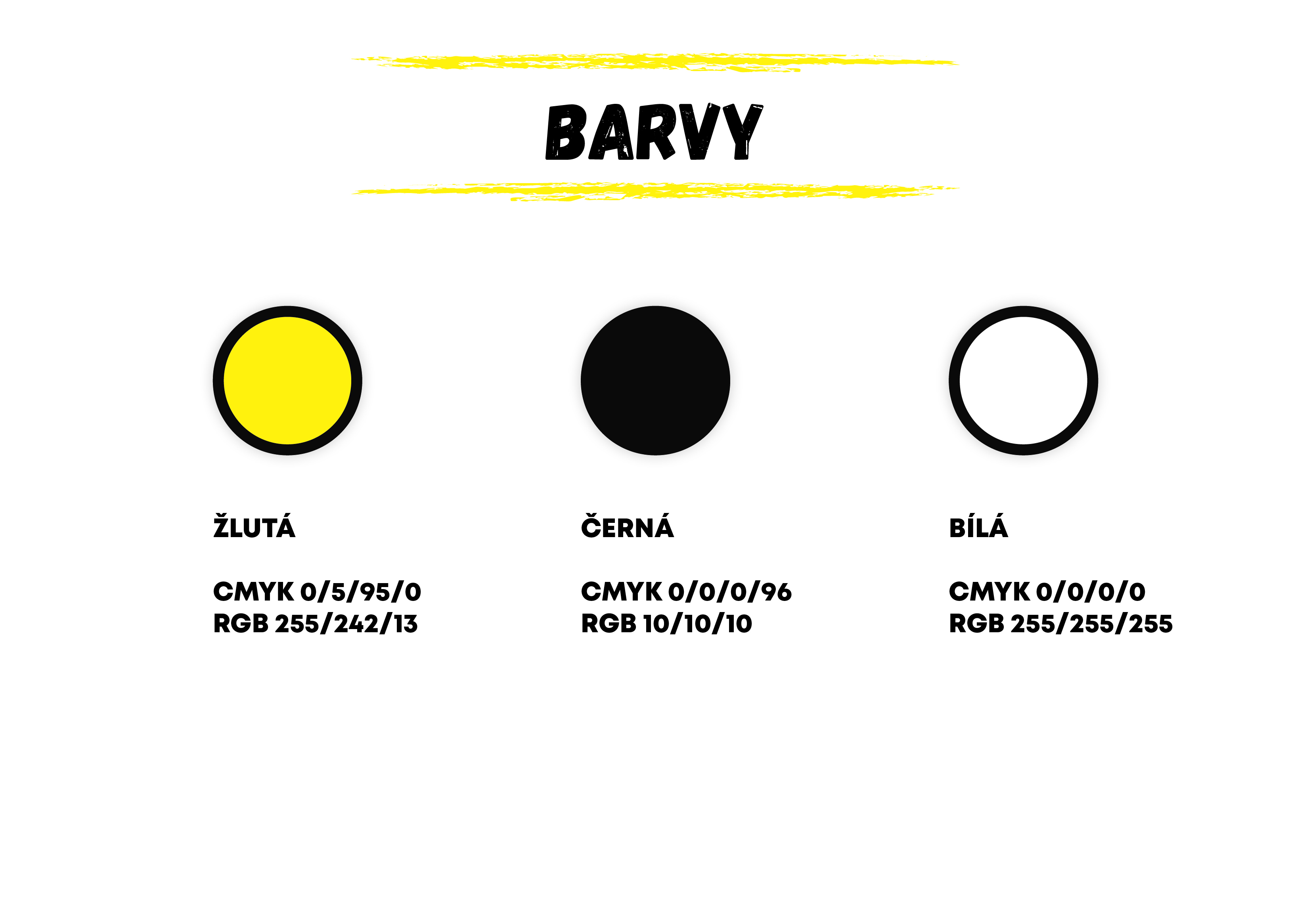
Colours
We chose black, yellow and white for clear graphic contrast, beer colour (yellow) and black to premiumise the brand.
Production
We’re not scared to go beyond our standard services. We created a luminous logo that MadCat could use for the world’s largest beer festival, Internationales Berliner Bierfestival.

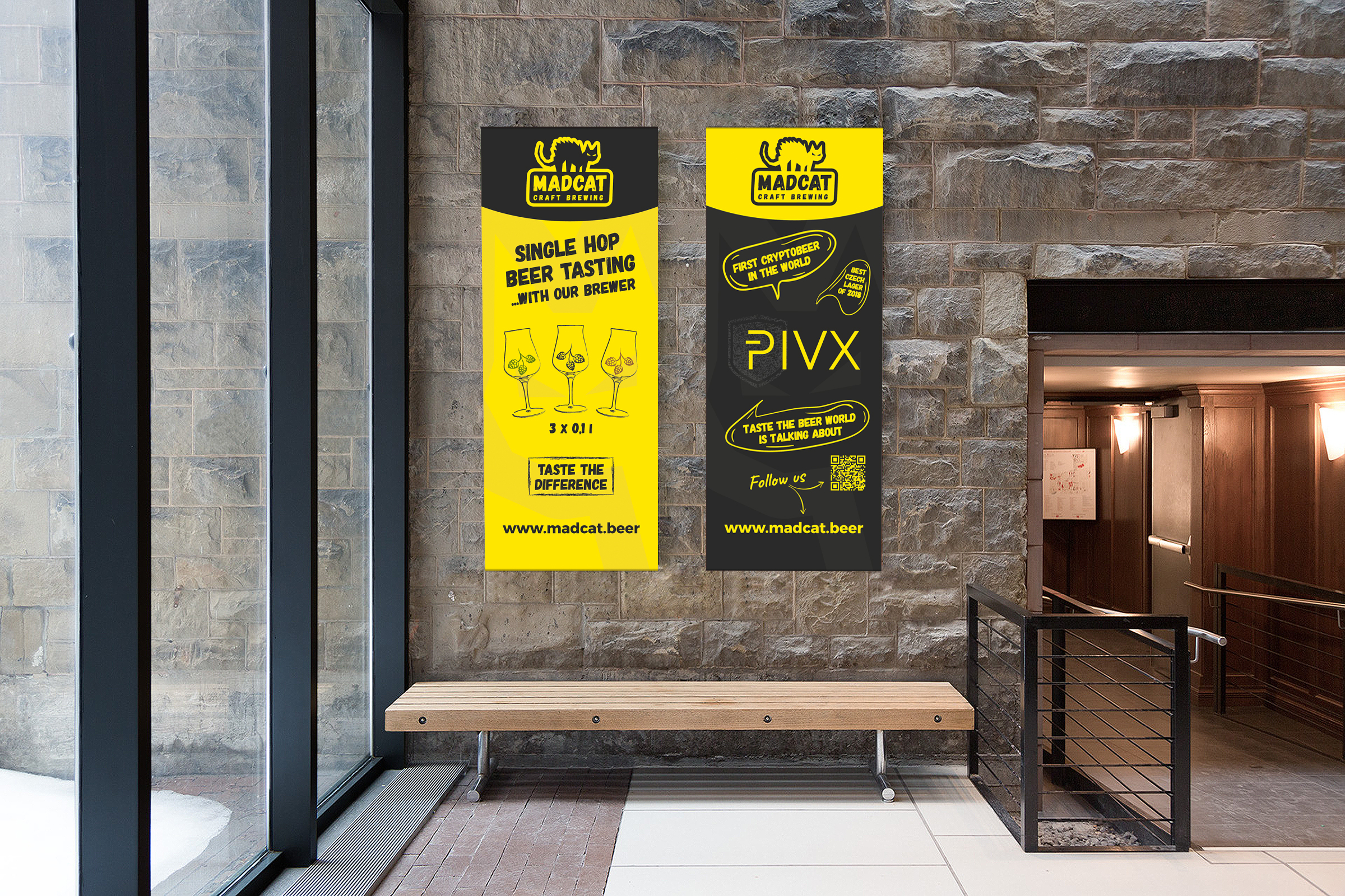
Use
For us, but especially for the client, the most important thing is to see how the brand works in everyday life. What will the banners on pub walls evoke in people? How will people feel when they grab an ice-cold bottle of beer and pop it open with the characteristic fizz? This is the last step which brings the brand to life.