Madcat
Pioneers of microbrewing in the Czech Republic have established a distinctive brand.
Pioneers of microbrewing in the Czech Republic have established a distinctive brand.
Pioneers of microbreweries in the Czech Republic have gained a distinctive brand that sets them apart from the competition at first glance
How can a collaboration between marketing freelancers and a budding microbrewery begin? Quite unexpectedly—with an internship in a hospital. It doesn’t seem to make much sense, does it? But only at first glance. In April 2016, Víťa Olšák, the future CEO of Four Bros, was still a medical student who dabbled in marketing. During a several-week internship at the Jihlava hospital, one afternoon he and his friends decided to unwind at a restaurant with a microbrewery in the town square.
Part of the visit included a tour with the head brewer, Jára, who casually mentioned that he and his partners were planning to start their own brand of beer. They envisioned brewing both specialty and classic styles in small batches to ensure 100% quality. They had already set their sights on an old distillery in Kamenice near Jihlava—a run-down but charming historical building from 1912, which would fit perfectly into their concept of creating a microbrewery that stood out from the crowd. A distinct brand would tie it all together.
The plan was sound; everything fit perfectly and made sense. So when Jára asked Víťa if he could help them create the brand for this new venture, there was simply no way to refuse. What started as a casual afternoon visit to a restaurant ended up laying the foundation for a highly intriguing and fruitful collaboration.
The MadCat microbrewery approached us with a request to create a complete brand from A to Z. In addition to coming up with a name, which didn’t exist at the time, we were tasked with designing the visual identity under which the new business would operate. This included creating a logo and selecting colors that not only reflected the company’s focus but also harmonized with each other.

We liked the concept as Jarda and his partners presented it to us from the beginning. In addition, we had the opportunity to taste his beer in the original establishment. That’s how we knew he really understood his craft. So it was immediately clear to us that we would be very happy to join the project and do everything to help it.
We were the first to think about what the new brewery should be called. In the name, we primarily wanted to project the way in which Jarda and his partners went into business and how he planned to run the business. It was mainly about innovation, progression and an overall approach to brewing that was different from other breweries.
The result of this effort was not to be hundreds of thousands of hectoliters of the average product sold in all the pubs in the area, but golden juice in smaller quantities, but still of first-class quality. This was also related to lower earnings compared to the competition. Such an approach seemed crazy to many industry experts. In short, “mad”.
In the end, a nice coincidence helped with the second part of the name. The client once mentioned during a conversation that a kitten had been roaming around the building and its surroundings since the first moment of the distillery’s reconstruction. He poked his nose everywhere, was interested in everything and made friends with everyone. Especially for a piece of salami or similar goodies. In the end, it stayed in place and became the brewery’s popular mascot. And after all, why couldn’t we project the mascot directly into the title? MadCat was born.
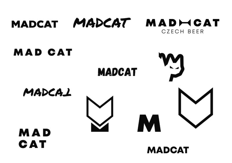
A very important part of the corporate identity is, of course, the logo. We also projected two assumptions into its form. Apart from the name itself, it was an analysis of the market segment the client was entering.
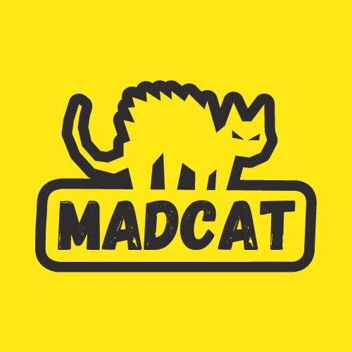
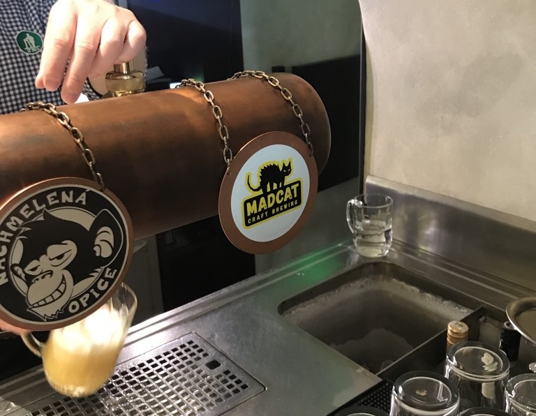
We chose a bristling, i.e. a crazy or angry cat as a logomark. This in the overall logo is supplemented by the name “MADCAT” in Gagalin Regular font. We purposely designed its appearance to be shabby. However, this is not self-serving, on the contrary. “Attrition” refers to the artisanal nature of the company, in which no one is afraid to lend a hand to the harder work when necessary.
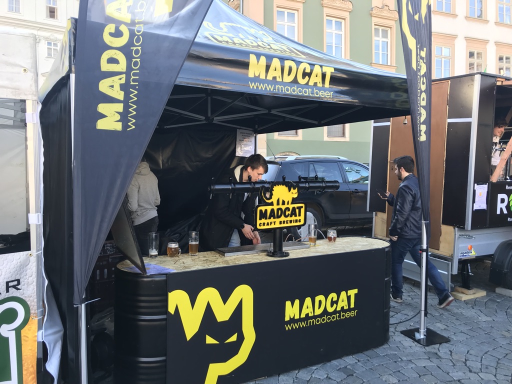
If necessary, the logo can also be supplemented with the inscription “CRAFT BREWING”, for which we have chosen the Mont Heavy font. This variant is used in cases where it is necessary to make it clear at first glance what the company does. It can be seen, for example, at markets, beer festivals and other similar events in which the brewery participates.
As a supplement, we also designed a completely separate visual of the cat’s head containing no text. The brewery uses this variant, for example, on some labels.
When creating the logo, we tried to keep it as simple as possible. We wanted it to be as variable as possible and easily adapted for different types of use, for example on labels, coasters, rollups or other marketing materials.
Along with the above, our goal was to create a clear counterpoint to other microbreweries. Many of them are currently presented with cartoon motifs and often unnecessarily complex graphics, which may not always be understandable and seem self-serving. As a result, individual businesses are difficult to distinguish from each other because of this. We clearly wanted to avoid that.
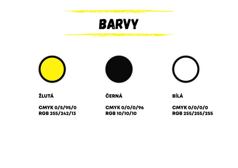
Correctly chosen colors underline the visual identity. For the MadCat microbrewery, after much deliberation, we chose a combination of black, yellow and white. Firstly, they provide a graphic contrast and complement each other very nicely, the yellow is also reminiscent of the golden color of beer. White then his foam again. Finally, black refers to the premium quality of the brand and its products.
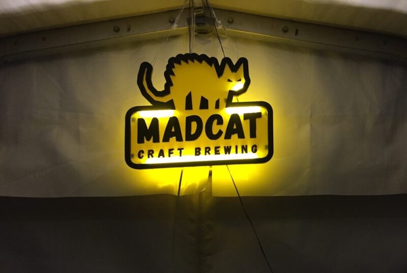
In the end, a little unplanned, we also made a lighted logo for the microbrewery. At that time, the newly born company was to present itself at the Internationales Berliner Bierfestival. We created the logo in the South Moravian Innovation Center on a CNC machine and a 3D printer.
Just for the sake of interest, let us mention that a friend helped us with electrical engineering and preparation, who later installed trackers in UN vehicles deployed in Afghanistan, Haiti and other “hot” places in the world. According to Jard, the logo performed well at the festival and attracted the attention of many passers-by.
Our cooperation accompanied by constant communication and openness soon bore fruit. The MadCat microbrewery very quickly established itself on the market and found its clientele not only among end customers, but also selected restaurants where it delivers its beer in barrels. According to the owner, the visual identity designed by us contributed greatly to this.
Even though MadCat no longer collaborates with Four Bros, we remember our work together very fondly. We are always pleased when we see the well-known “cat” logo on a stand in, for example, Víčep in Brno or when we come across their stand at beer festivals that we go to ourselves.
We have verified that we can successfully implement such a specifically focused project from start to finish and that even coincidences can have a very positive effect on the outcome of the work if they are taken to the right end.
